Small Business Website Accessibility on a Budget
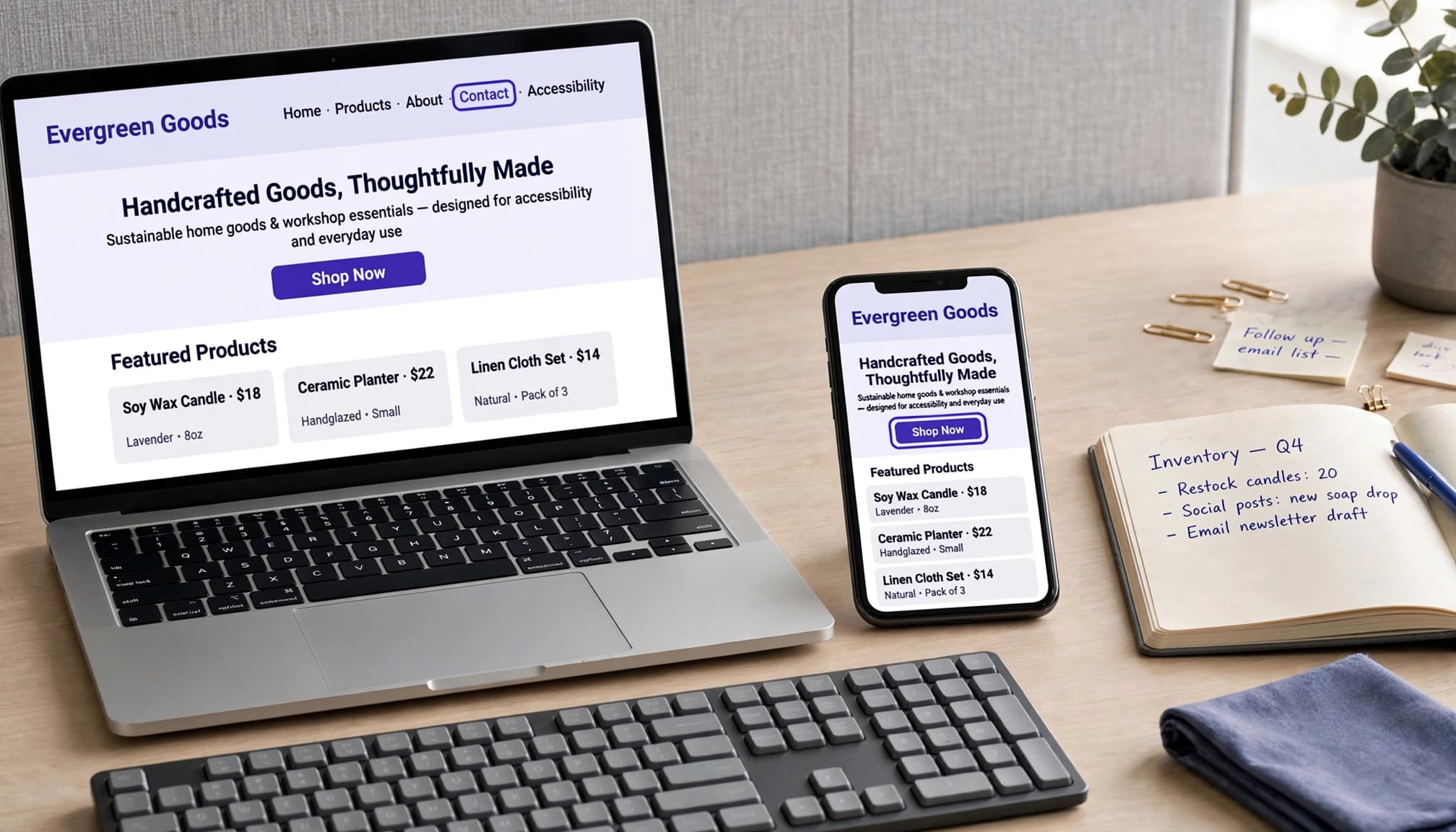
You can improve small business website accessibility with a focused web accessibility review of the pages customers rely on most. Start with essential customer tasks, then improve the rest of your site as time and budget allow.
When you’re balancing business, family, and everything in between, a website overhaul can feel overwhelming. You don’t have to tackle every page at once. Begin with the path someone takes to understand your offer and become a customer.
Set your small business website accessibility priorities
Accessibility helps people with vision, hearing, movement, and cognitive disabilities use your website. Clear text and easy-to-use controls also help customers on small screens or managing temporary injuries.
Start your review with a manageable plan:
- Follow the customer journey through your homepage, services or products, contact form, booking tool, and checkout.
- Fix barriers that prevent customers from taking action, such as keyboard-inaccessible menus, unlabeled fields, and unreadable buttons.
- Review supporting pages, videos, and downloads, then include accessibility in future updates.
Our website essentials for solo businesses can help you keep the customer journey clear.
Handle content changes yourself when possible. Reserve paid technical help for problems with templates, code, or third-party tools.
Understand the ADA and WCAG standards
Know which legal rules apply
ADA Title III covers businesses that operate a public accommodation. The Justice Department’s web accessibility guidance explains that ADA compliance obligations extend to their online goods and services.
The ADA itself names no website technical standard. As of October 2026, DOJ hasn’t adopted a specific standard for private-business websites under Title III. Courts differ on coverage, particularly for online-only businesses.
Courts have often referenced WCAG 2.0, while WCAG 2.1 Level AA is a commonly recommended target. A WCAG target can support accessibility work, but it can’t guarantee ADA compliance or protection from claims.
Seyfarth’s 2022 report on accessibility lawsuits gives 3,225 federal cases in its synopsis, up 12% over 2021. Its body contains a conflicting total. Neither an audit nor a widget guarantees protection against claims.
Choose a practical technical target
The Web Content Accessibility Guidelines, or WCAG, have three levels: A covers basic requirements; AA adds requirements commonly sought for business websites; AAA is the strictest and isn’t a blanket requirement.
Use WCAG 2.1 AA as a baseline, and request WCAG 2.2 AA for new development. W3C published WCAG 2.2 in October 2023. Most earlier criteria remain, but the update adds nine criteria and removes an obsolete parsing criterion. It’s more than a wording adjustment.
The federal WCAG 2.1 AA rule for state and local governments falls under Title II. It isn’t a universal private-business website rule.
Make keyboard navigation work first
Can someone request your services without touching a mouse? This is a useful place to start, and the first test costs nothing.
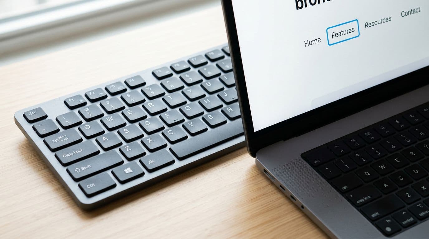
Open your site and set the mouse aside. Press Tab to move forward and Shift+Tab to move backward. Use Enter to activate links, Space for buttons where appropriate, and arrow keys within menus or other controls.
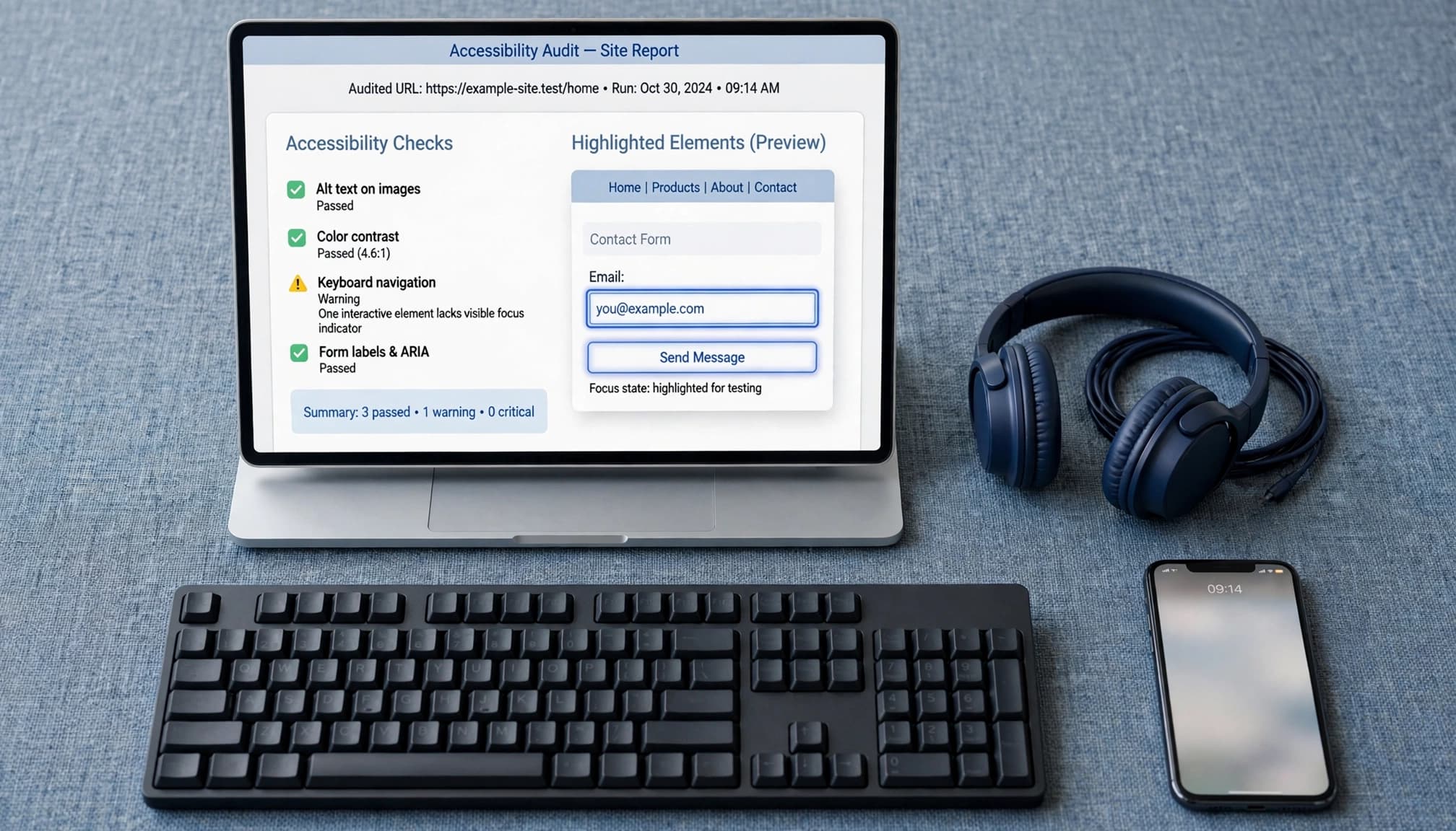
A visible focus indicator, usually an outline, should show which element you’re using. The order should follow the page logically.
Try opening the menu, completing a form, choosing a date, and dismissing a popup with Escape. If focus disappears, gets trapped, or skips a required control, record the page and action.
Ask your designer to repair the underlying control. Removing an outline because it clashes with your branding makes the problem worse.
Make text and images easier to understand
Check color contrast and mobile readability
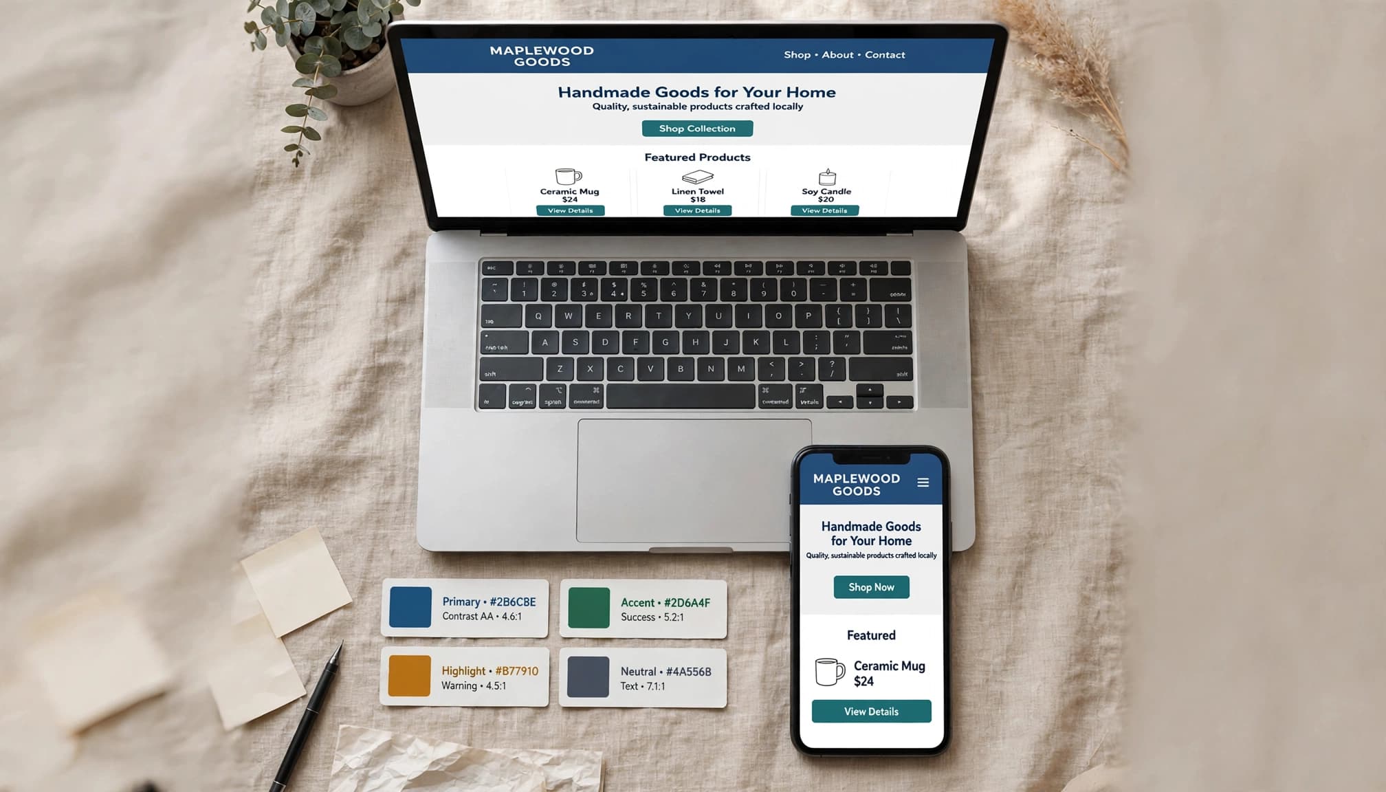
WCAG’s minimum text contrast requirements are 4.5:1 for normal text and 3:1 for large text. Large means at least 18 points, or 14 points when bold.
Use a free contrast checker and enter your text and background colors. Medium gray #777777 on white measures about 4.48:1, so it narrowly fails for normal text. Darken it rather than relying on appearance alone.
Read every important page on your phone. Text should remain readable without pinching, and buttons need enough room to tap comfortably. At 200% browser zoom, content and controls should still work.
Write useful content and image descriptions
Use short paragraphs, familiar words, and descriptive headings. Select actual heading levels in your editor rather than making ordinary text larger and bold. A logical heading structure helps readers navigate the page.
Keep prices, service details, and contact information as page text, not pictures of text. Name links clearly, such as “View appointment options.”
Useful, contextual alt text can support SEO by helping search engines understand meaningful images, but don’t stuff it with keywords. Decorative images usually need empty alt text.
View the page with images disabled or in text-only mode. Look for meaningful images whose information disappears without a description.
Help customers complete forms and use media
Give every field a clear label
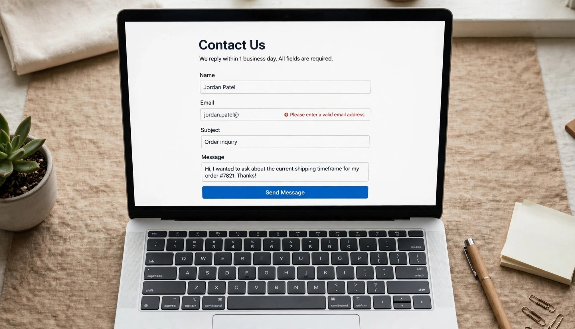
Accessible forms need a visible label for every field, concise instructions, and field-specific errors. Placeholder text disappears during typing and doesn’t replace one.
Keep required fields to what you need. Explain formats before customers submit, and avoid relying on red outlines alone to identify errors.
Place helpful error text beside the field: “Enter an email address that includes @.” Your developer should also connect labels, instructions, and errors to their fields in the code.
Test successful submissions, too. Customers need a clear confirmation that their inquiry, booking, or payment went through. A working form should leave them confident about what happens next.
Include captions and accessible downloads
Add accurate captions to prerecorded videos with speech. Review automatic captions for names, prices, and instructions. Provide transcripts for audio content and describe important visual information that narration doesn’t cover.
Flashing content can be one of the seizure triggers for some visitors, so keep it below three flashes per second. Give visitors control over moving content and avoid autoplaying audio.
Your PDFs, Word documents, and PowerPoint presentations need attention, too. Use proper headings, descriptive links, image descriptions, and a sensible reading order.
Adobe Acrobat and Microsoft Office have built-in accessibility checkers. Run them before publishing, then review reading order and usability manually. When practical, publish essential information as an accessible web page alongside the download.
Test with free tools and assistive technology
Combine automated and manual testing
A useful web accessibility review combines an accessibility audit of important pages with automated scans and manual checks. Free automated tools such as WAVE and axe DevTools can flag missing labels, contrast failures, and other code problems. Review the results manually, start with your busiest pages, and repeat scans after repairs.
An automated scan can’t determine whether every description is helpful or every booking process makes sense.
NVDA and JAWS are screen readers that read web content aloud. NVDA is free for Windows; VoiceOver is built into Apple devices. Listen to your headings, links, form labels, and confirmation messages.
Unexpected announcements or silent controls often need code-level repairs, such as semantic headings, accessible names, or correctly associated labels.
Use your platform’s tools, then retest
In WordPress, review image alternative text, heading blocks, and theme behavior. In Squarespace, review image block alt text and form labels. Wix’s Accessibility Wizard can help identify issues. Shopify merchants should review product image alt text and test cart and checkout behavior for their online store.
These tools support the work; they don’t certify the whole website.
If you hire help, request a fixed scope covering important templates, forms, keyboard behavior, and retesting. A repair list with priorities is more useful than a score alone.
When possible, include paid testing by people with disabilities who use assistive technology regularly. Their feedback can reveal barriers that a first-time screen reader test misses.
Publish an honest accessibility statement
An accessibility statement gives customers a clear way to report barriers. Include your target standard, known limitations, a monitored contact method, and the date of your latest review.
A useful starting point is:
We’re working toward WCAG 2.2 Level AA. If you have trouble using our website, contact us through the email address on our Contact page. Please share the page and task so we can help.
Use that wording only if it matches your work. Don’t claim full conformance without evidence.
Assign someone to respond. Add accessibility checks whenever you change a form, publish a download, or replace your theme.
Key takeaways
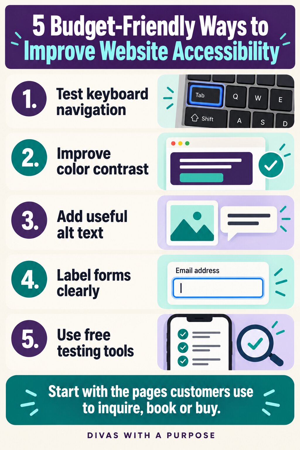
- Prioritize the pages and tools customers need to inquire, book, or buy.
- Combine keyboard testing, contrast checks, clear content, and assistive technology testing.
- Keep accessibility in your publishing routine so new content doesn’t reintroduce barriers.
Frequently asked questions
Are businesses with fewer than 15 employees exempt?
There isn’t a general Title III exemption for having fewer than 15 employees or operating fewer than 20 weeks yearly. Those thresholds relate to Title I employment coverage.
Title III exemptions include religious organizations and qualifying private clubs, with limits when club facilities are opened to the public. A small team alone doesn’t remove public-accommodation obligations.
Is WCAG 2.1 AA legally required for every business?
No universal federal Title III regulation requires every private-business website to meet WCAG 2.1 AA. However, accessibility duties still apply, and settlements or court orders can impose particular requirements. State laws may add obligations.
If you receive a demand letter, get legal advice rather than assuming a passing scan resolves it.
Can accessiBe or another widget handle everything?
accessiBe combines automated adjustments with an on-site interface for visitor preferences. Similar widgets may help with some settings, but they don’t replace accessible content, sound code, or testing.
Don’t spend your limited budget on a promised shortcut while your booking form remains unusable.
Build a more welcoming customer experience
A more accessible website helps customers take the next step with greater independence. Begin with one important journey, remove the barriers you find, and keep improving.
You don’t need to solve everything this week. Give steady attention to the parts of your website people depend on, and make accessibility part of how you care for your community.

Michelle D. Garrett is the founder of Divas With A Purpose.
She focuses on sharing resources for being purposely productive; setting personal and professional goals and achieving them through daily action; and successfully running a business while focusing on your mental health. Michelle is a full-time entrepreneur who specializes in teaching female entrepreneurs how to show up consistently in their business – online and off.